


With the flourishing mobile and web technologies, the user behavior is also changing. It has been observed that today, almost everyone possesses a smartphone or any other Internet-enabled device, and most of the mobile users prefer accessing the Internet via their handy devices. This has certainly added to the overall mobile traffic on the web (in fact, it has crossed the traffic generated from desktops).
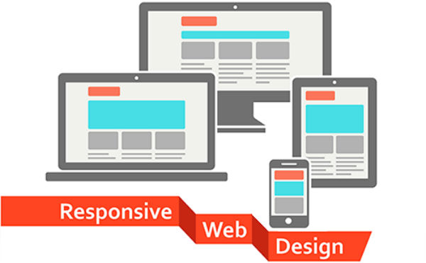
All these changes have encouraged web designers to opt a responsive design and efficiently target mobile users. With responsive website, you can ensure that your site appears great on any device and display the content in a legible fashion, without compromising on the overall quality. Many websites have already adapted responsive design, if you are still missing it, you are most probably lose a huge chunk of your business. Thus, it is recommended to go responsive and heighten your business visibility.
Here are a few golden rules that can help you embrace an outstanding responsive website with a flair and boost your business values.
1. Use Optimized Images

Showcasing large images on web portals can influence your desktop viewers, but it can dramatically impact the UX of your mobile users. Therefore, one must tweak images to make them appear visually appealing, while consuming minimal area on the screen real estate. For this, you will need to plan an image size by considering the screen size of the targeted device. You may have to design different images for desktop users and mobile users.
2. Integrate Compressed Data
To efficiently reduce the number of bytes that a page sends across the network, you can use compressed files; and gzip offers a great solution for this. By doing so, you can improve your site performance with an optimized loading speed, as it helps make an ideal usage of the server resources. It, thus, allows users to seamlessly navigate through your website.
Moreover, while compressed files can leverage your site performance, it is also advisable to minimize your CSS and JavaScript files by eradicating the extraneous white space and break lines.
3. Reap the benefits of Media Queries

Media queries in CSS3 offer great benefits that facilitate web content to respond appropriately by taking several aspects of a targeted device into account. It works proficiently to identify a few attributes of the targeted device like its resolution, orientation, width and height. Then, on the basis of this info, it implements the suitable CSS rules. Thus, media queries augment responsive design and play a significant role.
4. Try To Avoid Navigation Menus
By avoiding the main navigation menu, you can efficiently target small-screen mobile devices. However, you can rather offer an intuitive icon with text to indicate users that there is a menu. Like, it is viable to create a highly interactive drop-down menu to display the navigation menu. This helps make a great usage of the screen real estate, while ensuring an easy accessibility on any device. Thus, it is always recommended to replace a menu featuring multiple options with a drop down menu.
5. Invest in a viable hosting solution

Your server quality greatly impacts your site performance, and for this reason, it is advisable to kick around and choose an effective and proficient hosting package. There is a slew of hosting services and service providers available in the market. Each hosting package comes with an array of advantages and a pricing structure. To make it certain that your chosen service is the best suitable for your project, one needs to invest time and efforts in researching the available hosting services and their features.
A great way to seek the best service is to determine the hosting packages used by the successful websites in different niches and then, streamline your choice of keeping your website objectives in mind. There are several sources available on the Internet with which you can easily identify the hosting service provider of a particular website and go through its customer reviews and quality delivered.
6. Learn The Breakpoints And Grids
Before beginning the responsive web development, it is better to get yourself clear with all the basics. There are several useful things that can contribute to a prolific web design that appears great on all devices. For instance, breakpoints and grids allow one to create a valuable, responsive design that helps ensure a great readability and accessibility.
• The Grid based system allows one to create a web design over row and column structure.
• Breakpoint defines a point where content has to be moved to the next line, rather than keeping everything in a line.
7. Get Rid Of Extraneous Content
Keeping the unwanted content and UI elements at bay helps rev up the loading speed of a site, while enhancing the UX. Adding multiple elements in an interface will make it appear messy and clumsy, which can ruin the overall look and feel of a site. Therefore, it is better to get rid of elements that are not adding to the site’s usability and appearance.
8. Ensure an absolute legibility of content
Keep the small-screen devices in your mind while designing, and optimize the content accordingly to ensure that your content can be read without any headache. For this, implement a significant text size like 16 px or 12 pt. There are numerous proficient tools like FitText that facilitates one to create responsive text with a flair.
9. Take The Screen Orientation Into Account
There are two types of screen orientations, including portrait and landscape. Both the orientations must be considered while designing responsive website. And since, a whopping number of mobile users prefer landscape more, you must ensure an invaluable look and feel of your website, especially in the landscape orientation.
10. Use An Ideal Button Size

Screen size is paramount and must be kept in mind throughout the designing process. To augment navigation and accessibility ease, it is imperative to precisely design the UI elements. Minimum size for creating easily accessible buttons is 44 x 44 px. And, padding offers an absolute solution for this, rather than margins.
Take these tips into account and consider the invaluable Google guidelines to design an ultimate responsive website. This way, you can deliver awesome UX with an outstanding web performance on all devices.
About the Author
Victoria Brinsley is a mobile app programmer for Appsted Ltd – a reputed Android app development company. In case, you are willing to avail a detailed information on the same, get in touch.


